Mantine is the best overall React component library for 2026, 120+ components, 70 hooks, and RSC-native architecture at zero licensing cost; shadcn/ui is best for branded design systems where code ownership is non-negotiable; MUI is best for enterprise dashboards requiring commercially supported data grids. The right choice depends on RSC compatibility, component breadth, code ownership, and total licensing cost.
Most React component library comparisons fail on the criteria that matter most in 2026: they omit RSC and Next.js App Router compatibility (where Emotion-based libraries produce hydration errors in production) present MUI as free without disclosing MUI X Pro’s licensing cost for enterprise data components, and treat npm-installed styled libraries and code-owned registries like shadcn/ui as interchangeable without explaining the architectural trade-off that determines long-term maintainability and vendor lock-in risk.
PlugRoute has no affiliate relationships with any company listed, rankings are determined entirely by research data and objective evaluation criteria.
What Are the Top React Component Libraries in 2026? (TL;DR)
- Mantine is the broadest free React component toolkit in 2026, delivering 120+ components and 70 utility hooks with native-CSS RSC architecture, best for full-stack React and Next.js App Router teams.
- shadcn/ui is a CLI-based component registry that installs Radix UI and Tailwind CSS-powered components directly into the developer’s codebase, giving teams complete source-code ownership with zero vendor lock-in.
- MUI is the most downloaded React component library with approximately 4.5 million weekly npm installs as of January 2026; MUI X Pro adds commercially supported enterprise data grids, date pickers, and charts at a paid license, verify current pricing at mui.com/pricing.
- Ant Design is the richest free enterprise React component library for desktop-first B2B applications, delivering 60+ components with industry-leading form handling and data table features at zero licensing cost.
What Are the Different Types of React Component Libraries?
React component libraries fall into three architectural categories: styled npm packages, copy-paste source registries, and platform-specific design systems. Styled packages install as npm dependencies with pre-built theming APIs. Copy-paste registries distribute component source code via CLI into the developer’s codebase. Platform systems target specific ecosystems. This architecture type (not the component count) determines vendor lock-in exposure and customization ceiling.
The architectural model (not the feature count) is the most consequential React component library decision in 2026. Choosing between a styled npm package and a code-owned CLI registry determines your vendor lock-in exposure and customization ceiling more than any component count comparison chart.
As one user on r/reactjs described:
“My experience is UI libraries are great when you dont have a UX team and you need to develop something that looks a half decent. The moment you get a UX team and you need to work around the nuances of a component library you are in trouble and it might make sense to build from scratch.” Posted by u/simplescalar
Takeaway: The customization ceiling of styled npm-package libraries becomes a productivity liability the moment a product team adds dedicated design resources, validating this evaluation’s emphasis on architectural model over component count as the primary selection criterion.
Styled Package Libraries deliver components as npm dependencies with theming APIs and design tokens. Teams consume the components but do not own or edit the source directly. Libraries in this category:
Copy-Paste Component Registries distribute component source code via a CLI that installs TypeScript files directly into the developer’s project. Teams own and edit the installed code with no upstream dependency. Libraries in this category:
Platform Design Systems are component libraries built for a specific technology ecosystem rather than general-purpose use. Libraries in this category:
- Microsoft Fluent UI: designed for Microsoft Teams, SharePoint, and Azure applications.
The architectural distinction matters concretely: when a dialog component has a focus trap bug discovered in production, a fix for an npm-installed library ships in the next library release and lands in your project via one npm update command. With shadcn/ui, the team fixes the bug directly in the project’s Dialog.tsx file, or re-runs the CLI install to pull the upstream fix, overwriting any customizations. Neither model is superior; they represent different maintenance philosophies that compound meaningfully over a multi-year product lifecycle.
How Do the Top Component Libraries Compare at a Glance?
Seven React component libraries lead frontend development in 2026. Mantine leads for RSC-compatible free breadth (120+ components, native CSS v7+), shadcn/ui leads for code ownership (115,000+ GitHub stars as of June 2026), and MUI leads for ecosystem adoption (approximately 4.5 million weekly npm downloads as of January 2026). The table below compares all seven across category, best-for positioning, and key trade-offs.
| Rank | Company | Category | Best For | One-Line Summary | Key Capabilities | Primary Strength | Key Limitation |
|---|---|---|---|---|---|---|---|
| #1 | Mantine | Full-Stack Component Toolkit | Full-stack React and Next.js App Router teams needing the broadest free toolkit | Mantine is the most comprehensive free React component toolkit in 2026, combining 120+ components, 70 utility hooks, and RSC-compatible native CSS in a single MIT-licensed package with no paid tiers. | 120+ components, 70 hooks, native CSS (RSC-native since v7), built-in dark mode, interactive docs | Largest free component footprint; RSC-native since v7 (2023) | Single-maintainer sustainability risk; no corporate backing |
| #2 | shadcn/ui | Copy-Paste Component Registry | Branded design systems, Tailwind CSS teams, teams prioritizing source-code ownership | shadcn/ui is a Radix UI and Tailwind CSS-based component registry that installs accessible component source code directly into the developer’s project at zero cost and zero vendor lock-in. | 50+ components, CLI registry, Tailwind CSS styling, Radix UI accessibility primitives, multi-framework CLI v4 (March 2026) | Only library in this evaluation where teams own 100% of component source | Manual update management; Tailwind CSS is a non-negotiable dependency |
| #3 | MUI | Full-Featured Library + Enterprise Extension Tier | Enterprise dashboards needing the most-adopted library with paid data grids, pickers, and charts | MUI is the most widely downloaded React component library in 2026 with approximately 4.5 million weekly npm installs, offering a free Material Design library and a paid MUI X Pro extension for enterprise data components. | 50+ Material UI components, MUI X data grids/pickers/charts (paid), Joy UI, Base UI headless primitives | Most-downloaded React library (4.5M weekly, January 2026); MUI SAS corporate backing | Emotion-based CSS-in-JS causes RSC hydration errors in Next.js App Router; deep customization is friction-intensive |
| #4 | Ant Design | Enterprise Design System | Data-heavy B2B applications, desktop-first teams needing the richest free enterprise component set | Ant Design is Alibaba’s enterprise React UI library delivering 60+ free components with industry-leading form and data table capabilities, 600+ Figma-synchronized design tokens, and a dedicated AI-interface extension. | 60+ components, advanced form handling, data tables, 600+ Figma design tokens, Ant Design X (AI interfaces) | Richest free enterprise component set; Ant Group corporate backing; only library with dedicated AI interface product line | Mobile interaction gaps documented in production; partial RSC compatibility |
| #5 | PrimeReact | Enterprise Component Suite | Maximum component breadth, cross-framework organizations, large-dataset data tables | PrimeReact is a design-agnostic React library with 90+ enterprise-grade components; including a community-validated virtual-scroll DataTable; from PrimeTek, a commercial vendor with parallel libraries for Angular, Vue, and Java. | 90+ components, virtual-scroll DataTable, TreeSelect, Scheduler, Gantt, cross-framework PrimeTek suite, design-agnostic themes | Highest component count with specialized enterprise widgets; 16-year institutional history; only cross-framework vendor in evaluation | Community adoption trails feature breadth; partial RSC compatibility; niche component bugs documented |
| #6 | Chakra UI | Accessible Component Library | Rapid development, small teams, style-props ergonomics, accessible-by-default UI | Chakra UI is an accessible React component library with a style-props API, built-in dark mode, and 40+ components, transitioning to Ark UI headless primitives in v3 for improved RSC compatibility. | 40+ components, style-props API, Ark UI primitives (v3), semantic token dark mode, accessibility-first architecture | Most ergonomic style-props API for rapid development; accessibility-first component model | Partial RSC compatibility (“compatible but not fully optimized”); v2-to-v3 migration overhead is a current TCO risk |
| #7 | Microsoft Fluent UI | Platform Design System | Microsoft 365 ecosystem apps; SharePoint, Teams, Azure, Power Apps | Microsoft Fluent UI is Microsoft’s official design system and React component library, deployed across Teams and Office 365 at hundreds-of-millions-of-users scale, with Fluent 2 React v9 delivering significant rendering improvements per Microsoft’s internal benchmarks. | 70+ components, Fluent 2 design language, multi-platform coverage (Web/iOS/Android/Windows), token-driven design system | Production-validated at Microsoft Teams and Office 365 scale; strongest institutional maintenance guarantee in this evaluation | Accessibility-enforced color constraints limit brand customization; narrow community footprint outside the Microsoft ecosystem |
Weighted Scores (out of 10): Mantine 8.45 | shadcn/ui 8.40 | MUI 7.15 | Ant Design 7.15 | PrimeReact 6.45 | Chakra UI 6.00 | Fluent UI 5.55. Tied scores are broken by weekly npm download volume. Full scoring rubric in the Methodology section.
Component counts, pricing, and RSC compatibility status are verified as of June 2026. Check linked official sources before making adoption decisions.
Which Component Library Should I Choose for My Use Case?
The right React component library depends on your team’s primary constraint. RSC and Next.js App Router compatibility points to Mantine or shadcn/ui. Code ownership and zero vendor lock-in points to shadcn/ui. Commercially supported enterprise data grids points to MUI with MUI X Pro. Maximum free component breadth points to Mantine. Microsoft 365 ecosystem integration requires Fluent UI.
| Your #1 Priority | Recommended Tool | Why | Acceptable Alternative |
|---|---|---|---|
| RSC / Next.js App Router compatibility | Mantine | Native CSS v7+ is fully RSC-compatible with no hydration workarounds | shadcn/ui (Tailwind, also fully RSC-native) |
| Broadest free component set | Mantine | 120+ components + 70 hooks at zero licensing cost | PrimeReact (90+ components, free core) |
| Code ownership and zero vendor lock-in | shadcn/ui | CLI installs component source into your codebase; teams own and edit directly | Mantine (if breadth is needed alongside ownership preference) |
| Commercially supported enterprise data grids | MUI (with MUI X Pro) | MUI X Pro delivers commercially managed advanced grids, pickers, and charts | PrimeReact (free DataTable with virtual scroll) |
| Richest free enterprise features with no licensing cost | Ant Design | 60+ enterprise components, fully free, Ant Group backed | Mantine (broader component count, also free) |
| Maximum component count, desktop-first data-heavy apps | PrimeReact | 90+ components including virtual-scroll DataTable with strongest large-dataset community validation | Ant Design (60+ components, free, similar enterprise depth) |
| Building a Teams extension or SharePoint app | Microsoft Fluent UI | Only library in this evaluation purpose-built for the Microsoft 365 ecosystem | No equivalent alternative in this evaluation |
| Style-props ergonomics and accessible-by-default UI | Chakra UI | Style-props API for fastest initial development velocity; accessibility-first component model | Mantine (comparable DX, broader components, RSC-native) |
| React and Angular codebases; one vendor | PrimeReact (PrimeTek suite) | PrimeNG (Angular) + PrimeReact (React) + PrimeVue (Vue) under one design system | No equivalent cross-framework vendor in this evaluation |
| Tailwind CSS integration with accessible behavior | shadcn/ui | Tailwind is the native styling layer; Radix UI provides accessible behavior primitives | Mantine (CSS variables, not Tailwind; different approach) |
Team size calibration:
- Solo developer or 2-person team: shadcn/ui or Chakra UI minimize setup complexity.
- 5–15 person product team: Mantine or shadcn/ui with a defined component governance process.
- 15+ person enterprise team with procurement requirements: MUI (MUI SAS corporate entity), Ant Design (Ant Group backing), or Fluent UI (Microsoft institutional guarantee).
1. Mantine: Best Overall: Best for Full-Stack React Development
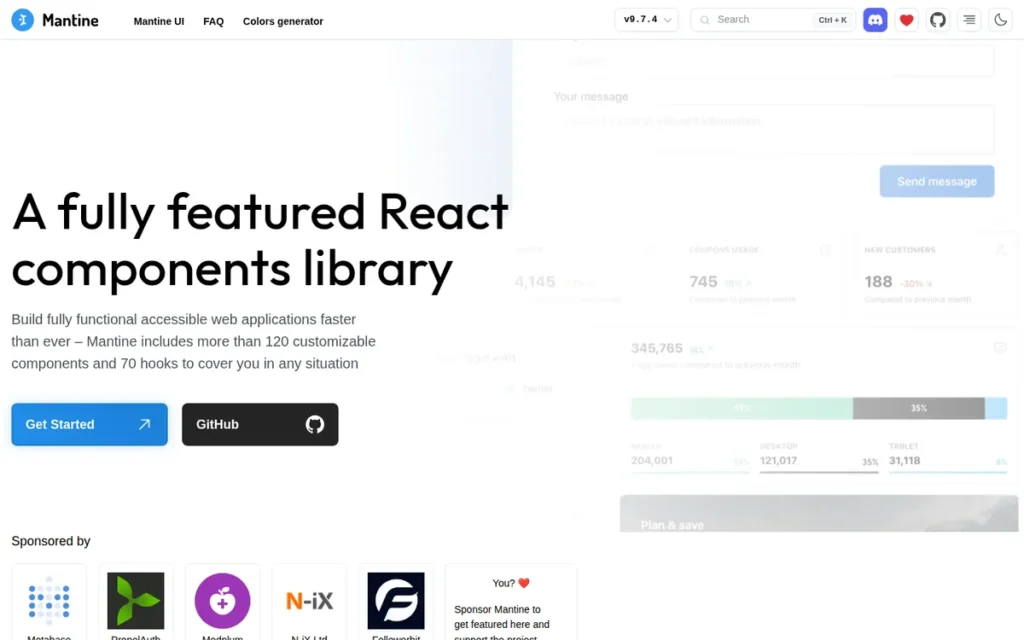
Category: Full-Stack Component Toolkit, a comprehensive, fully-free React library delivering 120+ styled components and 70 application-utility hooks with native-CSS architecture for React Server Components compatibility.
At a Glance
- Category: Full-Stack Component Toolkit
- Best For: Teams building full-stack React or Next.js App Router applications who need the broadest free component set without runtime CSS-in-JS overhead or enterprise licensing costs
- Price Range: Free (MIT license, no paid tiers: OpenCollective sponsorships accepted but no paywalled features; verify at mantine.dev)
- Primary Strength: Mantine delivers the largest free component footprint in the React ecosystem (120+ components plus 70 utility hooks) with native CSS architecture confirmed to support React Server Components since v7 (2023)
- Biggest Limitation: Mantine is primarily maintained by a single core developer, introducing long-term sustainability risk that corporate-backed libraries (MUI, Ant Design, Fluent UI) do not carry
- One-Line Summary: Mantine is the most comprehensive free React component toolkit in 2026, combining 120+ components, 70 utility hooks, and RSC-compatible native CSS in a single MIT-licensed package with no paid tiers.
- Last Verified: June 2026
Overview
Mantine is a fully-featured React component library launched in 2020 that provides frontend and full-stack developers with 120+ customizable UI components and 70 application-utility hooks, the broadest free single-package React toolkit available in 2026. Mantine ships form management, notification systems, modal managers, date pickers, rich text editing, and a comprehensive hooks collection alongside its UI components, reducing or eliminating the need for supplementary hook libraries such as react-use.
Mantine’s v7 architectural shift from Emotion runtime CSS-in-JS to native CSS with CSS variables makes Mantine one of only two libraries in this evaluation with a native CSS or build-time CSS architecture confirmed to support Next.js App Router and React Server Components without documented hydration workarounds as of June 2026, placing Mantine ahead of MUI, Ant Design, Chakra UI, PrimeReact, and Fluent UI on the dimension most consequential for new projects (Mantine v7 changelog, mantine.dev/changelog/7-0-0/, 2023).
Key Features
- 120+ Customizable Components: Mantine ships 120+ React components spanning foundational controls (buttons, inputs, selectors), layout primitives (grids, shells, drawers), data display (tables, timelines, badges), and advanced application components (including a rich text editor, date and time pickers, and a Spotlight command palette) the second-highest component count in this evaluation.
- 70 Bundled Utility Hooks: Mantine includes 70 utility hooks covering application-level needs (
useForm,useLocalStorage,useWindowScroll,useMediaQuery,useInterval, and 65+ additional hooks) reducing or eliminating the need for supplementary hook libraries and making Mantine a near-complete application development toolkit rather than a pure component set. - Native CSS Architecture (RSC-Ready): Mantine’s v7+ architecture replaced Emotion CSS-in-JS with native CSS and CSS variables, delivering React Server Components compatibility and eliminating the hydration errors that Emotion-based libraries cause in Next.js App Router environments, confirmed in the Mantine v7 changelog (mantine.dev/changelog/7-0-0/, 2023).
- Built-In Dark Mode via CSS Variables: Mantine provides a built-in dark mode system driven by CSS variables and semantic design tokens, enabling automatic light/dark switching without JavaScript-mediated style recalculation, important for both performance and accessibility compliance.
- Interactive Documentation: Mantine’s documentation includes a Ctrl+K powered search modal, Ctrl+J dark/light toggle, live-editable component demos, and TypeScript-generated API references, consistently praised in community comparisons as superior to PrimeReact’s and competitive with MUI’s documentation quality.
Best For
Mantine is best for full-stack React and Next.js App Router teams who need a wide component surface, utility hooks, and RSC compatibility without licensing costs, particularly teams evaluating MUI or PrimeReact who want equivalent breadth with zero paywalled tiers.
Pricing
Mantine is entirely free under the MIT license as of June 2026. Mantine has no paid tiers, no paywalled components, and no commercial subscription plans. Mantine accepts OpenCollective sponsorships to fund development but offers no paywalled features in exchange. Verify current status at mantine.dev.
Strengths
- Growth Trajectory: Mantine surpassed PrimeReact in weekly npm downloads within approximately four years of its 2020 launch (despite PrimeReact’s 12-year head start) reflecting genuine developer preference rather than a one-time spike, as documented in npm trends data cited in r/reactjs community discussions (2023–2025).
- RSC Compatibility Pioneer: Mantine’s v7 migration from Emotion to native CSS in 2023 made Mantine one of the first major React component libraries to achieve confirmed React Server Components compatibility without hydration workarounds, placing Mantine ahead of MUI, Ant Design, and Chakra UI on the dimension most consequential for new Next.js App Router projects (Mantine v7 changelog, mantine.dev/changelog/7-0-0/, 2023).
- Community-Validated Enterprise Readiness: Mantine’s enterprise viability is confirmed across multiple r/reactjs discussions: “I have had great experience with Mantine in both large and small projects” (u/Salty_Comedian100, 26 upvotes, r/reactjs) and “Mantine community support is really huge. I’ve used it in two enterprise projects so far” (u/weird_indian_guy, 15 upvotes, r/reactjs).
- Zero Licensing Cost for Full Feature Set: Mantine is fully free under MIT with no paywalled components (unlike MUI, where MUI X Pro requires a paid license for data grids, pickers, and charts) meaning teams access the complete 120+ component set at zero cost (mantine.dev, verified June 2026).
This aligns with community sentiment on r/reactjs:
“No, I have used Mantine for the last ten or so projects, with minimal theme customization. The first project I ever did I built my own components, never again, it’s a productivity killer, especially when you learn about Mantine Hooks, that lets you kick out a site in a week.” Posted by u/skwyckl
Takeaway: Mantine’s bundled hooks library eliminates the custom-component productivity trap that consumes teams on lighter libraries, enabling full-stack delivery velocity that multi-year practitioners consistently report as a category-defining differentiator.
Limitations
- Single-Maintainer Sustainability Risk: Mantine is primarily maintained by one core developer (Vitaly Rtishchev) sustained by OpenCollective sponsorships rather than corporate backing, a risk explicitly raised in r/reactjs discussions and contrasted directly with MUI (MUI SAS), Ant Design (Ant Group/Alibaba), and Microsoft Fluent UI (Microsoft), all of which carry institutional continuity guarantees that Mantine does not.
- Dynamic CSS Complexity Post-Migration: Mantine’s v6-to-v7 native CSS migration introduced new friction for dynamic styling scenarios: community feedback identifies dynamic CSS values as “a little bit complicated/convoluted compared to what it used to be” (u/zynix, r/reactjs), a real trade-off for teams that relied on Emotion’s dynamic style injection in v6.
- Known Layout Edge-Case Bugs: Mantine’s AppShell header positioning has a documented community bug,
element.scrollTofails when content is hidden behind a fixed header, demonstrating that Mantine’s component breadth does not guarantee bug-free coverage of all layout edge cases (u/zynix, r/reactjs).
Verdict
Mantine is the highest-scoring free React component library in a head-to-head evaluation across component breadth, RSC compatibility, pricing transparency, documentation quality, and community-validated enterprise readiness as of June 2026. Mantine’s 120+ components and 70 hooks eliminate the need for supplementary libraries that MUI, Ant Design, and Chakra UI require, and Mantine’s native CSS architecture delivers RSC and Next.js App Router compatibility that Emotion-based libraries have yet to fully match. The single-maintainer sustainability profile is a genuine long-term risk that enterprise teams should weigh against Mantine’s technical advantages before committing to multi-year adoption.
2. shadcn/ui: Best for Branded Design Systems and Code-Owned Components
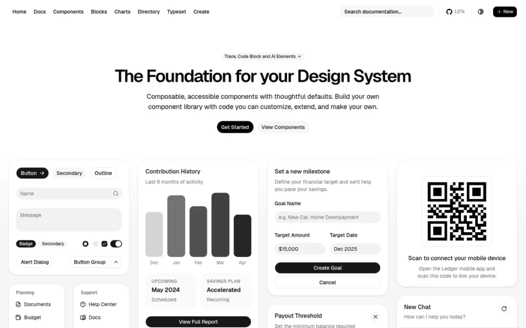
Category: Copy-Paste Component Registry, a CLI-distributed system that installs component source code directly into your project, built on Radix UI primitives and Tailwind CSS, giving teams full ownership of every component with no npm-package dependency.
At a Glance
- Category: Copy-Paste Component Registry
- Best For: Teams building branded, design-system-driven products on React or Next.js who need code ownership, Tailwind CSS compatibility, and Radix UI accessibility without vendor lock-in
- Price Range: Free (no paid tiers, no subscription: CLI and all components are open source; verify at ui.shadcn.com)
- Primary Strength: shadcn/ui is the only component system in this evaluation that gives teams complete source-code ownership of every component, enabling unlimited customization without fighting an upstream library’s API or theming abstractions
- Biggest Limitation: shadcn/ui components are not updated automatically: teams must re-run CLI installation to receive bug fixes or new variants, creating a manual maintenance overhead that grows proportionally with the number of components adopted
- One-Line Summary: shadcn/ui is a Radix UI and Tailwind CSS-based component registry that lets frontend teams own, modify, and ship accessible components without npm-dependency lock-in, at zero cost.
- Last Verified: June 2026
Overview
shadcn/ui is not a traditional component library, shadcn/ui’s official documentation explicitly states: “This is not a component library. It is how you build your component library”, distinguishing shadcn/ui architecturally from every other entry in this evaluation. shadcn/ui distributes Radix UI-powered, Tailwind CSS-styled components via a CLI that installs full TypeScript source code directly into the developer’s codebase, giving teams complete ownership of every component rather than consuming a third-party npm dependency.
Backed by Vercel through official Next.js integration and developer academy content, shadcn/ui accumulated 115,000+ GitHub stars by June 2026, surpassing both MUI (~97K) and Ant Design (~97.8K) to become the most-starred React component repository in this evaluation, with CLI v4 released in March 2026 confirming ongoing active development (shadcn/ui changelog v4).
“I would not use either of those libraries. Use radix ui via shadcn/ui. Absolutely best in class experience and the right balance between do-it-yourself and pre-built.” (u/TimothyKrell, r/reactjs)
Takeaway: Experienced React developers increasingly describe shadcn/ui as the middle path between fully styled libraries (too opinionated) and raw headless primitives (too much setup), validating the copy-paste registry architecture this evaluation identifies as a distinct category.
Key Features
- CLI-Driven Code Ownership: shadcn/ui distributes components via a CLI registry model, running a single install command copies the component’s full TypeScript/React source code into the developer’s project, making every component fully editable without API workarounds, theme overrides, or waiting for upstream bug fixes, as documented in official shadcn/ui docs.
- Radix UI Accessible Behavior: shadcn/ui uses Radix UI headless primitives as the behavioral foundation for all interactive components (dialogs, dropdowns, tooltips, tabs, popovers), providing WCAG-compliant keyboard navigation, focus management, and ARIA attribute handling inherited from Radix’s accessibility-first architecture.
- RSC-Native Tailwind CSS Architecture: shadcn/ui’s Tailwind CSS styling layer generates all styles at build time rather than runtime, making shadcn/ui natively compatible with React Server Components and Next.js App Router without the hydration errors that affect Emotion-based libraries, a critical 2026 selection criterion.
- Multi-Framework CLI Support: shadcn/ui CLI v4 (released March 2026) supports multi-framework project initialization across Next.js, Remix, Astro, and Vite, allowing teams to adopt the same component registry pattern regardless of their meta-framework choice (shadcn/ui changelog v4).
- Active Community Registry: shadcn/ui supports 50+ core components spanning layout, form controls, data display, feedback, and overlay patterns, with an extensive community extension registry (awesome-shadcn-ui on GitHub) adding third-party components beyond the core set.
Best For
shadcn/ui is best for teams building branded products on React or Next.js who have an established or planned design system, use Tailwind CSS, and prioritize design-system ownership and long-term code control over the out-of-box defaults and breadth that npm-installed libraries provide.
Pricing
shadcn/ui is entirely free with no paid tiers, no subscriptions, and no commercial components as of June 2026. All components, the CLI, and the registry are open source. Verify current status at ui.shadcn.com.
Strengths
- Most-Starred React Component Repository: shadcn/ui reached 115,000+ GitHub stars by June 2026, surpassing both MUI (~97K) and Ant Design (~97.8K), an extraordinary growth trajectory from launch to category leader in under three years, confirming genuine developer demand rather than marketing-driven adoption (GitHub, June 2026).
- Institutional Backing Without Corporate Control: Vercel’s official developer academy includes shadcn/ui core concepts documentation (Vercel Academy, 2025), and Next.js project scaffolding exposes shadcn/ui to millions of developers as a default starting-point resource, providing institutional distribution reach without corporate ownership of the project.
- Developer-Validated Code Control: Community adoption confirms the design-system-ownership thesis: “I recently switched to shadcn so that I have more control over the components” (u/justinbars, r/reactjs), a migration pattern from styled libraries (including Chakra UI) to shadcn/ui documented repeatedly in r/reactjs discussions from 2023–2025.
- RSC Compatibility on Par with Mantine: shadcn/ui’s Tailwind CSS architecture provides confirmed RSC and Next.js App Router compatibility (matching Mantine v7+’s native CSS advantage) allowing teams to use shadcn/ui in App Router-first projects without the hydration workarounds required by Emotion-based libraries.
Limitations
- Manual Update Management: shadcn/ui’s greatest structural trade-off is the inverse of its greatest strength, because components are team-owned rather than npm-imported, there are no automated updates, and teams that adopt 30–40 shadcn/ui components must re-run individual CLI install commands to receive bug fixes, accessibility improvements, or new variants, creating a maintenance surface that requires intentional governance to prevent drift from upstream improvements.
- Tailwind CSS Non-Negotiable Dependency: shadcn/ui requires Tailwind CSS as a mandatory dependency, which may conflict with existing stylesheets or team preferences in projects that don’t already use Tailwind, making it a poor fit for non-Tailwind codebases regardless of its other advantages.
- Narrower Component Count for Enterprise Data Needs: shadcn/ui’s 50+ component set does not match the breadth of Mantine (120+) or PrimeReact (90+) for data-heavy enterprise applications, teams requiring virtual-scroll data tables, Gantt views, complex schedulers, or tree selectors will need to supplement shadcn/ui with additional libraries.
Users on r/reactjs noted:
“I feel the premise of shadcn is wrong. You ‘install’ their components into your code base, and are free to modify them how you like, but then you risk losing a consistent design system, because every component ‘can’ be custom. By then, you might as well just treat them as starting points that you have to customise afterwards. Mantine and RadixUI for me are sane middle grounds. Both have great flexible building blocks, and tie everything to centrally controlled CSS variables. This makes it easy to build a searchable combobox (something Mantine already has) because it’s just methods and composed components.” Posted by u/chrismastere
Takeaway: Without explicit component governance, shadcn/ui’s code-ownership model can fragment a design system rather than empower it, a structural trade-off teams must budget for intentionally before scaling the registry pattern across a large component footprint.
Verdict
shadcn/ui is the highest-ranking component system in this evaluation for teams whose primary requirement is design system ownership and brand-differentiated UI, earning a near-identical weighted score to Mantine (8.40 vs. 8.45) with a different optimization target. shadcn/ui eliminates vendor lock-in at the architectural level by placing all component code inside the team’s codebase, making shadcn/ui the only library in this evaluation where customization has no ceiling imposed by an upstream library’s API or theming abstractions, though teams remain within React’s component model and Radix UI’s behavioral primitive constraints. Teams on Tailwind CSS and Next.js App Router with 30–50 component needs will find shadcn/ui the fastest path to a branded, accessible, RSC-compatible UI system; teams needing 90+ components or bundled utility hooks should evaluate Mantine as a complement or alternative.
3. MUI (Material UI): Best for Enterprise Dashboards and Teams Needing Commercially Supported Data Components
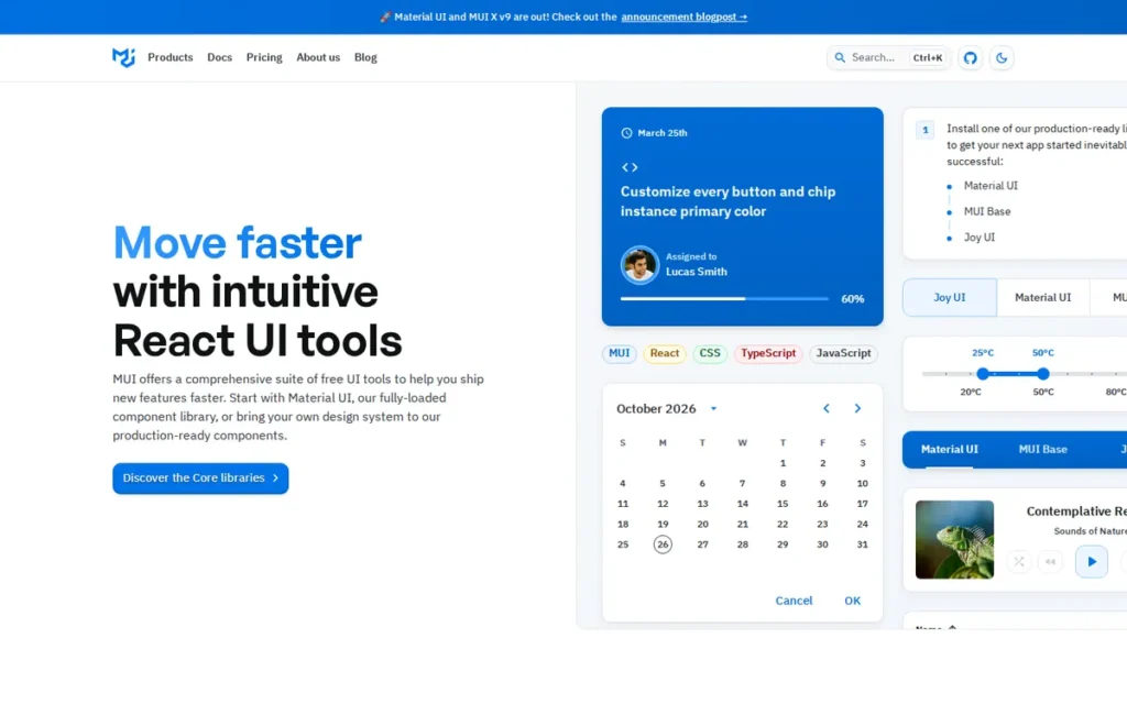
Category: Full-Featured React Library with Enterprise Extension Tier, a free open-source Material Design React library with a paid MUI X Pro tier that unlocks advanced data grids, date pickers, and charts for enterprise applications.
At a Glance
- Category: Full-Featured React Library with Enterprise Extension Tier
- Best For: Enterprise and product teams building data-intensive dashboards and admin panels on React who need the most widely adopted library with commercially supported advanced data components
- Price Range: Free (MUI Core/Material UI, MIT) + MUI X Pro: pricing changed to an application-based model in April 2026; prior to this change, per-developer annual licensing was published at $299/developer/year. Verify current pricing at mui.com/pricing.
- Primary Strength: MUI is the most-downloaded React component library on npm with approximately 4.5 million weekly downloads as of January 2026, backed by MUI SAS (a commercial entity) and offering a four-product suite spanning free Material Design components to commercially supported enterprise data extensions
- Biggest Limitation: MUI’s Emotion-based runtime CSS-in-JS creates documented hydration errors in Next.js App Router environments, and community feedback consistently identifies deep customization as friction-intensive: “It’s great till you want to customize” (u/RogueGingerz, r/reactjs, 2024)
- One-Line Summary: MUI is the most widely downloaded React component library in 2026 with approximately 4.5 million weekly npm installs, offering a free Material Design library and a paid MUI X Pro extension for enterprise data grids, date pickers, and charts.
- Last Verified: June 2026
Overview
MUI (formerly Material-UI) is a comprehensive React UI platform developed by MUI SAS. MUI provides frontend and enterprise development teams with four distinct products:
- Material UI: free open-source component library implementing Google’s Material Design
- MUI X: paid enterprise components including data grids, date pickers, and charts
- Joy UI: alternative design system within the MUI ecosystem
- Base UI: unstyled headless primitives for custom design systems
MUI is the most downloaded React component library on npm, receiving approximately 4.5 million weekly downloads as of January 2026, reflecting production deployment across millions of applications (react-pdf-kit.dev roundup, January 2026).
MUI’s primary limitations are its Emotion-based runtime CSS-in-JS architecture, which creates documented hydration errors in Next.js App Router environments, and persistent customization friction consistently characterized in community feedback as “great till you want to customize” (u/RogueGingerz, r/reactjs, 2024).
Key Features
- 50+ Production-Ready Material UI Components: MUI Material UI delivers 50+ React components implementing Google’s Material Design (spanning layout, navigation, inputs, data display, and feedback patterns) with documentation that includes interactive demos and TypeScript-generated API references that community sources consistently name as a top competitive strength.
- MUI X Enterprise Extensions: MUI X provides paid enterprise components including the MUI X Data Grid (virtual scrolling, filtering, editing, grouping), MUI X Date Pickers (accessible date/time/range pickers), and MUI X Charts, components requiring substantial engineering effort to replicate from scratch and not available at enterprise quality in the free MUI Core tier.
- MUI Base for Headless Customization: MUI Base UI provides the same API surface as MUI components but with zero styling, allowing teams to use MUI’s component logic, accessibility, and event systems while supplying entirely custom visual presentation, functioning as MUI’s answer to headless libraries for teams that want MUI’s API without Material Design aesthetics.
- Four-Product Platform Architecture: MUI’s four-product suite allows teams to start opinionated and migrate toward custom design systems without switching vendors or rebuilding component logic, a progression path from Material UI’s out-of-box defaults to Base UI’s fully unstyled primitives under one commercial umbrella.
- Corporate Sustainability Guarantee: MUI SAS has operated as a product company for approximately a decade, providing the procurement and long-term adoption assurance that community-maintained libraries (Mantine, Chakra UI) cannot match, a distinction explicitly valued in enterprise architecture reviews requiring vendor stability documentation (MUI official documentation).
Best For
MUI is best for enterprise and product teams building data-intensive React applications (particularly dashboards, admin panels, and internal tools) who need the most widely adopted library with commercially supported advanced data grids and charts, and whose teams have sufficient MUI experience to manage deep customization work.
Pricing
MUI Core / Material UI is free and MIT-licensed. MUI X Pro (required for advanced data grids, date/time pickers, and charts) changed to an application-based licensing model in April 2026. Prior to this change, per-developer annual licensing was published at $299/developer/year. Teams using only the core component set incur no licensing cost. Verify current pricing at mui.com/pricing before making adoption decisions.
Strengths
- Dominant Ecosystem Adoption: MUI receives approximately 4.5 million weekly npm downloads as of January 2026, roughly double Ant Design’s 2.43 million and more than six times Chakra UI’s 700,000, reflecting production deployment across millions of applications and the largest ecosystem of third-party plugins, tutorials, and Stack Overflow answers in this evaluation (react-pdf-kit.dev roundup, January 2026).
- Corporate Maintenance Guarantee: MUI SAS has operated as a product company for approximately a decade, providing the enterprise procurement and long-term maintenance guarantees that community-backed libraries (Mantine, Chakra UI) cannot match, a distinction explicitly valued in enterprise architecture reviews (MUI official documentation; Flatlogic MUI overview).
- Genuinely Excellent Documentation: MUI’s documentation is consistently named as one of its top competitive strengths even by developers who ultimately chose alternatives: “One thing MUI did great is its documentation, which provides a lot of examples almost covering every common use case” (u/Aegis8080, r/reactjs), a “praise within criticism” pattern confirming the documentation quality is genuine.
- Managed Enterprise Data Components: MUI X Pro’s data grid component provides a commercially supported alternative to building virtual-scroll, filterable, groupable data tables from scratch, functionality that takes significant engineering effort to replicate and is the primary justification for MUI X Pro’s licensing cost in enterprise dashboard contexts (MUI.com, 2026).
Users on r/reactjs shared a balanced perspective:
“Almost every thread about ui frameworks I see some group describing some framework as ‘the worst I’ve used’ and the truth is everything has pros and cons. If you want a rock solid library that does most things, has enterprise support, and can be restyled easily, mui is a great choice. Their mui-x data grid is also the best I’ve worked with for Controlled usage though less full-featured than something like AgGrid. If you want to roll out an internal tool rapidly with lots of goodies to simplify your code, don’t care about styling beyond basic colour tweaks, need a great Select component out the box, imperative notification/modal rendering, Ant Design is a great choice. This being one example of an alternative and its pros/cons, but there are loads of ui systems out there now” Posted by u/Veranova
Takeaway: Practitioners who have used multiple React libraries consistently identify MUI’s data grid and enterprise support as its genuine differentiators (separate from the polarized online discourse) while acknowledging Ant Design as the strong free alternative for rapid internal tooling.
Limitations
- RSC Hydration Risk: MUI’s Emotion-based runtime CSS-in-JS generates styles at JavaScript runtime rather than build time, producing documented hydration errors in Next.js App Router environments (the default starting point for new React projects in 2026) with developers citing RSC incompatibility as a primary driver of migrations to Mantine and shadcn/ui (r/reactjs discussions, 2024).
- Persistent Customization Friction: Community feedback from 2024 confirms that MUI remains “great till you want to customize” (u/RogueGingerz, r/reactjs, 2024), and teams with strong brand requirements that diverge from Material Design aesthetics consistently report disproportionate engineering time on theme overrides, a problem MUI Base partially addresses but does not fully resolve for teams without deep MUI expertise.
- Enterprise Licensing Cost for Data Components: MUI X Pro requires a paid license for data grids, date/time pickers, and charts (components that are fully free in Mantine and Ant Design) with per-developer annual licensing published at $299/developer/year prior to the April 2026 model change. Teams must verify current pricing at mui.com/pricing and budget accordingly before treating MUI as a free solution.
Verdict
MUI is the most widely adopted React component library in 2026 and the default choice for enterprise teams building data-intensive dashboards who need commercially supported data grids, pickers, and charts. MUI’s RSC compatibility limitations and documented customization friction place MUI third in this ranking, behind Mantine (broader free feature set, RSC-native) and shadcn/ui (code-owned, RSC-native). MUI and Ant Design tie in weighted score (7.15/10); MUI ranks third on tiebreak due to higher weekly npm downloads (4.5M vs. 2.43M) and stronger community documentation scores. For teams already invested in the React ecosystem operating at enterprise scale who are willing to budget for MUI X Pro, MUI remains the most battle-tested and widely-supported option available.
4. Ant Design: Best Free Enterprise Library for Data-Heavy B2B Applications
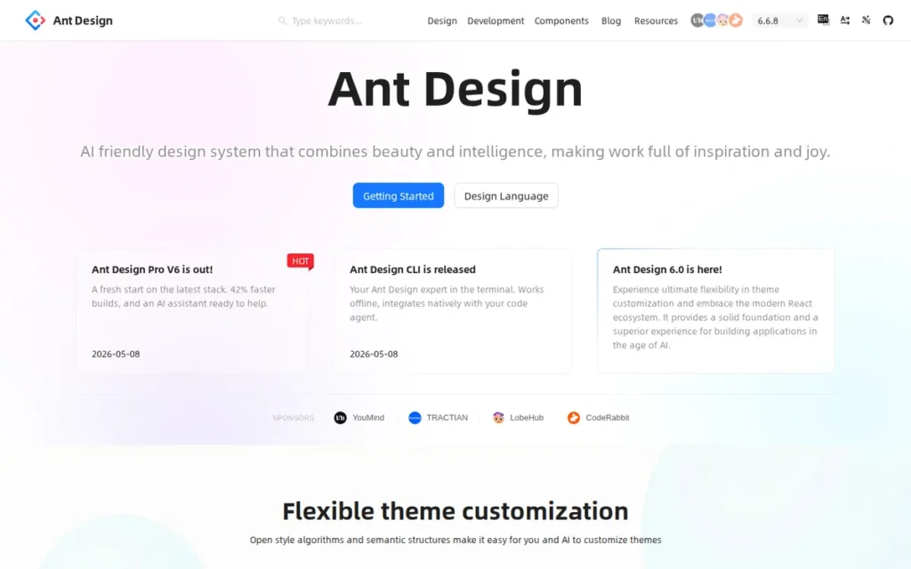
Category: Enterprise Design System, a comprehensive free React UI library and design language developed by Alibaba’s Ant Group, optimized for data-heavy B2B applications with 60+ components, 600+ design tokens, and a dedicated AI-interface extension (Ant Design X).
At a Glance
- Category: Enterprise Design System
- Best For: Product teams building data-heavy B2B dashboards, admin panels, and enterprise applications on React who need the richest free enterprise component set and are primarily targeting desktop browsers
- Price Range: Free (100% open source, MIT license: no paid tiers, no commercial plans; verify at ant.design)
- Primary Strength: Ant Design provides the richest free enterprise React component set in 2026 (60+ components with the most comprehensive built-in form handling and data table features among the libraries evaluated) at zero licensing cost, backed by Alibaba’s Ant Group
- Biggest Limitation: Ant Design’s mobile interaction fidelity has documented gaps, community reports confirm some production teams built custom replacement components for dropdowns and date pickers to achieve acceptable mobile UX, a significant engineering cost invisible in desktop-focused feature comparisons
- One-Line Summary: Ant Design is Alibaba’s enterprise React UI library, delivering 60+ free components with industry-leading form and data table capabilities, 600+ Figma-synchronized design tokens, and an AI-interface extension (Ant Design X).
- Last Verified: June 2026
Overview
Ant Design is an enterprise-class React UI library and design language developed by Alibaba’s Ant Group, with 97,758 GitHub stars and 2.43 million weekly npm downloads as of March 2026 (AdminLTE React UI comparison, March 2026). Ant Design delivers 60+ production-ready components, a 600+ token Figma design system synchronized with the component library (v6), and an ecosystem of enterprise extensions, including ProComponents (admin UI toolkit), Ant Design X (AI and chat interface components), Charts, and Mobile.
Ant Design is entirely free with no paid tiers, making it the richest free enterprise component set in the category and a compelling alternative to MUI for teams that would otherwise budget for MUI X Pro. Ant Design X positions Ant Design as the only library in this evaluation with an official product line targeting AI application interfaces (Ant Design X official, 2026).
Key Features
- Industry-Leading Form and Data Table Components: Ant Design provides 60+ React components with built-in form handling, validation, advanced data tables with sorting, filtering, and pagination, date/time pickers, cascading selectors, and navigation patterns, described in independent comparisons as having “the richest built-in form handling and data table features” among evaluated React libraries (AdminLTE comparison, March 2026).
- Ant Design X, Dedicated AI Interface Extension: Ant Design X provides AI and chat interface UI components, including conversation bubbles, prompt suggestion inputs, and streaming text displays, making Ant Design the only library in this evaluation with an official product line targeting AI application interfaces (Ant Design X official, 2026).
- 600+ Figma-Synchronized Design Tokens: Ant Design System v6 includes 600+ design tokens synchronized between the Figma design kit and the React component library (Figma Community, 2026), enabling design-to-code workflows where token changes propagate to component theming without manual reconciliation.
- v5+ CSS Variables and Token Architecture: Ant Design v5+ replaced the LESS-based styling system with CSS Variables and a design token architecture, enabling runtime theme switching (including dark mode) through token overrides rather than full CSS regeneration, resolving the long-standing community complaint about styling inflexibility.
- Ant Group Corporate Backing and Scale: Ant Design is maintained by Ant Group with 2,314 public contributors and 904 npm versions released as of 2026 (Figma Community, 2026), reflecting a development cadence and contributor depth that provides enterprise-grade sustainability alongside Ant Group’s commercial backing at Alibaba scale.
Best For
Ant Design is best for product and enterprise teams building complex B2B dashboards, admin tools, and data-intensive internal applications on React who need comprehensive out-of-box enterprise components at zero licensing cost and primarily target desktop browsers.
Pricing
Ant Design’s core library and all components are entirely free under an MIT license as of June 2026. Ant Design has no paid tiers, no commercial plans, and no paywalled features, a decisive advantage over MUI, where MUI X Pro requires a paid license for comparable data grid and picker functionality (prior to April 2026 model changes, that tier was listed at $299/developer/year). Verify at ant.design.
Strengths
- Market-Scale Adoption: Ant Design has 97,758 GitHub stars and 2.43 million weekly npm downloads as of March 2026, placing it second only to MUI in community adoption scale and confirming production deployment at global enterprise scale (AdminLTE React UI comparison, March 2026).
- Zero-Cost Enterprise Parity: Ant Design is entirely free with no paid component tiers, providing form handling and data table functionality that requires the paid MUI X Pro tier in the MUI ecosystem, a meaningful licensing budget advantage for enterprise teams, as MUI X Pro was listed at $299/developer/year prior to April 2026 pricing model changes (Ant Design official site; AdminLTE comparison, March 2026).
- Institutional Sustainability at Ant Group Scale: Ant Group’s corporate backing (Alibaba-scale deployment, 2,314 contributors, 904 npm versions released) provides enterprise sustainability comparable to MUI’s corporate guarantee, contrasting with community-funded libraries like Mantine and Chakra UI where single-maintainer risk is documented (Ant Design GitHub, 2026).
- Only Library with a Dedicated AI Interface Product Line: Ant Design X adds an AI-interface component product line with officially supported chat bubble, streaming text, and prompt suggestion components, positioning Ant Design uniquely for teams building AI-augmented web applications alongside traditional enterprise UI (Ant Design X official, 2026).
Limitations
- Mobile Interaction Gap: Ant Design’s most consequential operational limitation is mobile interaction fidelity, at least one production team reported building complete custom replacement components because Ant Design’s dropdowns and date pickers delivered insufficient mobile UX: “going as far as creating our own components to render in place of the ant ones for mobile devices” (u/Roci89, r/reactjs), a hidden engineering cost invisible in desktop-focused feature comparisons.
- Accessibility Documentation Gaps: One independent accessibility review warns that Ant Design’s “documentation and support around accessibility, screen readers, and keyboard navigation may be insufficient for some strict requirements” (Dumbo Design review, 2025), a meaningful liability for enterprise teams with WCAG audit mandates in government, healthcare, or financial services.
- Partial RSC Compatibility: Ant Design’s RSC and Next.js App Router compatibility is partial, teams building on App Router should validate compatibility with their specific component usage before committing, as Ant Design’s CSS architecture follows partial-compatibility patterns similar to other non-Tailwind, non-native-CSS libraries in this evaluation.
Verdict
Ant Design is the best free enterprise React component library for desktop-first B2B applications in 2026, delivering the richest out-of-box data table and form handling at zero licensing cost, a decisive advantage over MUI where comparable functionality requires the paid MUI X Pro tier. Ant Design ranks fourth rather than third because its mobile interaction gaps require engineering workarounds, its accessibility documentation trails WCAG-mandated standards (as noted by one independent review, Dumbo Design, 2025), and its weekly downloads (2.43M) trail MUI (4.5M), indicating a smaller ecosystem for third-party tooling. Teams building primarily desktop-facing enterprise dashboards without strict mobile or WCAG-audit requirements will find Ant Design the strongest free-tier competitor to MUI.
Users on r/reactjs noted:
“The ‘basically everything you will need’ is the biggest draw and the reason I use it. It has the most complete set of components I have found in any library and it’s free. It’s not the most customizable, best designed, best documented, or smallest footprint, but it’s great if you want to get up and running fast or are a small operation and don’t have a design team to style everything by hand.” Posted by u/devuxer
Takeaway: Ant Design’s free component breadth makes it the pragmatic choice for teams prioritizing delivery speed over deep customization, but experienced practitioners consistently flag its styling and documentation limitations as the cost of that out-of-box completeness.
5. PrimeReact: Best for Maximum Component Breadth and Cross-Framework Design System Consistency
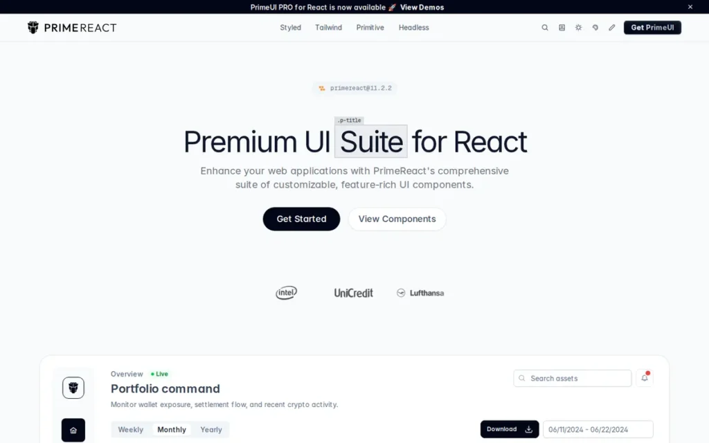
Category: Enterprise Component Suite, a design-agnostic React library with 90+ components from PrimeTek, a commercial UI vendor with 16+ years of enterprise UI development and active parallel libraries for Angular (PrimeNG), Vue (PrimeVue), and Java (PrimeFaces).
At a Glance
- Category: Enterprise Component Suite
- Best For: Enterprise teams needing maximum component breadth: particularly advanced virtual-scroll data tables and specialized widgets, or organizations using multiple frontend frameworks who want cross-framework design system consistency from a single vendor
- Price Range: Free core library (MIT) + paid commercial ecosystem: PrimeBlocks (prebuilt UI block collections), admin templates (Sakai), and PrimeReact PRO support tier. Verify current pricing at primereact.org/pricing, 2026.
- Primary Strength: PrimeReact provides 90+ components including specialized enterprise widgets (virtual scroll data tables, tree selects, Gantt views, schedulers) not available at equivalent maturity in lighter free libraries, backed by PrimeTek’s 16-year institutional history in enterprise UI development
- Biggest Limitation: PrimeReact’s community adoption metrics significantly trail its feature breadth (Mantine, launched 12+ years after PrimeTek, has surpassed it in weekly downloads) indicating a perception gap that compounds with a smaller ecosystem for Stack Overflow coverage and third-party tutorials
- One-Line Summary: PrimeReact is a design-agnostic React component library with 90+ enterprise-grade components (including a community-validated virtual-scroll DataTable) from PrimeTek, a commercial vendor with parallel libraries for Angular, Vue, and Java.
- Last Verified: June 2026
Overview
PrimeReact is an enterprise-class React UI component library developed by PrimeTek, a commercial UI vendor with 16+ years of enterprise interface development history dating to PrimeFaces for Java in 2008. PrimeReact delivers 90+ components including advanced data tables with virtual scrolling, tree selectors, autocomplete, Gantt views, and schedulers that are not available at equivalent maturity in lighter free libraries, positioning PrimeReact as the maximum-breadth option in this evaluation.
PrimeReact’s weekly npm download count trails both MUI and Mantine based on npm trends data referenced in r/reactjs discussions (2023–2025); teams can verify current figures at npmjs.com/package/primereact. PrimeTek’s cross-framework strategy (offering matched component libraries for React (PrimeReact), Angular (PrimeNG), Vue (PrimeVue), and Java/JSF (PrimeFaces)) is unique in this evaluation and directly relevant to enterprise organizations managing applications across multiple frontend stacks.
Key Features
- 90+ Components Including Advanced Enterprise Widgets: PrimeReact delivers 90+ React components including specialized enterprise widgets (virtual-scroll DataTable for high-volume datasets, TreeSelect for hierarchical data, AutoComplete, Scheduler, and Gantt components) that require significant custom engineering to replicate from scratch in lighter libraries like Mantine, Chakra UI, or shadcn/ui (PrimeReact official site, June 2026).
- Design-Agnostic Multi-Theme Architecture: PrimeReact’s design-agnostic architecture ships with multiple built-in themes modeled after Material Design, Bootstrap, and Fluent UI, plus a Theme Designer tool, meaning teams are not locked into a specific visual language and can adopt PrimeReact regardless of their existing design system.
- Cross-Framework PrimeTek Suite: PrimeTek’s suite provides matching component libraries for React (PrimeReact), Angular (PrimeNG), Vue (PrimeVue), and Java (PrimeFaces), enabling organizations managing multiple frontend stacks to standardize on consistent component APIs, design tokens, and visual language across technology boundaries, a capability unique in this evaluation (PrimeTek official, 2026).
- v9 Documentation Rehabilitation: PrimeReact v9 (February 2023) delivered a complete documentation rebuild including 700+ new component demos, TypeScript-generated API documentation, and Algolia-powered search, a deliberate Phase 1 rehabilitation that PrimeTek CEO Cagatay Civici confirmed publicly on Reddit (u/cagataycivici, r/reactjs, February 2023).
- Companion Production Ecosystem: PrimeReact’s companion suite includes PrimeFlex (CSS utility library), PrimeIcons (icon set), and PrimeBlocks (paid prebuilt UI block collections for rapid page assembly), a comprehensive production toolchain for teams that adopt the full PrimeTek stack.
Best For
PrimeReact is best for enterprise teams requiring advanced data table components with virtual scrolling for high-volume datasets, teams managing both React and Angular (or Vue) codebases who want cross-framework design system consistency from a single vendor, and organizations that benefit from PrimeTek’s commercial PRO support tier for mission-critical applications.
Pricing
PrimeReact’s core library is free and open-source as of June 2026. PrimeTek’s commercial revenue comes from PrimeBlocks (prebuilt UI block collections), premium admin templates (Sakai), and PrimeReact PRO (priority support and direct developer assistance). PrimeTek CEO Cagatay Civici confirmed this model publicly: “Templates, Theme Designer and Commercial Support” are the paid offerings (u/cagataycivici, r/reactjs). All 90+ core components remain free under MIT. Verify current pricing at primereact.org/pricing.
Strengths
- Community-Validated Large-Dataset DataTable: PrimeReact’s DataTable component with virtual scrolling is the most community-validated in this evaluation for high-volume dataset display: “The Prime suite is the most underrated front end library. It’s an absolute beast at handling large datasets. Best UI framework IMO” (u/MadBroCowDisease, r/reactjs, 2023), directly addressing enterprise large tabular data rendering without custom engineering.
- Longest Institutional Track Record: PrimeTek’s 16-year institutional history (PrimeFaces since 2008) provides the longest vendor track record in this evaluation, with CEO Cagatay Civici personally active in developer community discussions on Reddit, a level of founder-community engagement signaling long-term product commitment rare among enterprise UI vendors (PrimeTek official).
- Unique Cross-Framework Vendor: PrimeTek’s cross-framework suite: PrimeReact (React), PrimeNG (Angular), PrimeVue (Vue), PrimeFaces (Java), is the only offering in this evaluation enabling design system consistency across multiple frontend frameworks under a single vendor, a meaningful advantage for enterprise organizations managing mixed technology stacks (PrimeTek official, 2026).
- Transparent Community Roadmap: PrimeReact v9’s documentation overhaul (700+ component demos, Algolia search, TypeScript-generated APIs) was accompanied by a public roadmap where the PrimeTek CEO confirmed Phase 1 as documentation rehabilitation and Phase 2 as styling API improvements, a community accountability posture rare in the component library category (u/cagataycivici, r/reactjs, February 2023).
Limitations
- Adoption-to-Capability Gap: PrimeReact’s most consequential trade-off is a persistent gap between technical capability and market adoption, despite feature parity with MUI and Ant Design for approximately four years, Mantine (launched in 2020, 12+ years after PrimeTek) has surpassed PrimeReact in weekly npm downloads (npm trends data cited in r/reactjs), creating a smaller community ecosystem for third-party tooling, tutorials, and Stack Overflow answers that compounds developer onboarding time.
- Niche Component Reliability: Community production users report that specific complex components have lingering bugs blocking real use cases, “most components work well. The only one I couldn’t use due to bugs is the treeselect” (u/baboy_ka, r/reactjs, referenced in 2024 comparison thread), a risk pattern on large component surfaces where breadth can trade off against depth of QA coverage for every specialized component.
- Partial RSC Compatibility: PrimeReact’s RSC and Next.js App Router compatibility is partial, teams on App Router should validate their specific component usage before committing to full adoption, as PrimeReact’s architecture has not completed the native-CSS migration that gives Mantine v7+ its RSC-native advantage.
Verdict
PrimeReact is the strongest option in this evaluation for teams whose primary criterion is maximum React component breadth (particularly advanced virtual-scroll data tables and specialized enterprise widgets) or for organizations managing React and Angular codebases who want cross-framework design system consistency from a single vendor. PrimeReact ranks fifth rather than higher because its community adoption metrics significantly trail its feature depth, its RSC compatibility is partial, and specific niche components have documented production bugs requiring pre-adoption validation. For teams where DataTable performance at scale is the decisive criterion, no other free library in this evaluation has equivalent community-validated evidence for large-dataset DataTable performance at the scale PrimeReact addresses.
6. Chakra UI: Best for Accessible Rapid Development and Style-Prop-First Teams
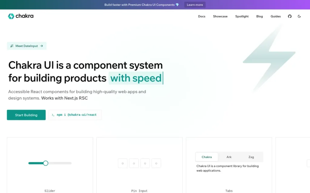
Category: Accessible Component Library, a React component system built around a style-props API for rapid accessible UI development, transitioning to Ark UI headless primitives in v3 to reduce CSS-in-JS runtime overhead.
At a Glance
- Category: Accessible Component Library
- Best For: React developers who prioritize developer ergonomics, accessibility by default, and rapid prototyping, particularly small teams and early-stage product companies who value the style-props API for fast UI construction
- Price Range: Free core library (MIT) + Chakra UI Pro provides premium component templates, block collections, and design resources (exact pricing not publicly confirmed as of June 2026, verify at chakra-ui.com)
- Primary Strength: Chakra UI’s style-props API: where CSS properties are applied directly as React component props, provides the most ergonomic rapid-development experience among styled React libraries, combined with built-in accessible ARIA patterns and dark mode support
- Biggest Limitation: Chakra UI v3’s RSC compatibility is officially described as “compatible but not fully optimized,” and existing v2 users face a significant architectural migration to v3 involving the new Ark UI-based component model that creator Segun Adebayo’s own blog describes as a fundamental change
- One-Line Summary: Chakra UI is an accessible React component library with a style-props API, built-in dark mode, and 40+ components, transitioning to Ark UI headless primitives in v3 for improved RSC compatibility.
- Last Verified: June 2026
Overview
Chakra UI is an accessible React component system created by Segun Adebayo that provides frontend developers with 40+ pre-styled components, a style-props API where CSS values are applied directly as component props, and built-in dark mode support through semantic design tokens. Chakra UI has 40,000+ GitHub stars and 700,000+ weekly npm downloads as of January 2026 (react-pdf-kit.dev, January 2026), reflecting a strong developer community that has been partially redirected toward shadcn/ui by developers seeking greater source-code ownership, a migration pattern documented in r/reactjs discussions from 2023–2025.
Chakra UI v3 introduces Ark UI primitives as the behavioral foundation (replacing the previous Emotion CSS-in-JS runtime with a more composable, headless-aligned architecture) in response to developer demand for React Server Components compatibility (Segun Adebayo’s blog, 2024). Chakra UI v3 officially confirms RSC compatibility, though GitHub discussion #10197 notes the library is “compatible but not yet fully optimized.”
Key Features
- Style-Props API for Ergonomic Development: Chakra UI’s style-props API allows developers to apply CSS properties directly as component props (background color and padding set directly as JSX attributes) eliminating separate CSS files, styled-component wrappers, or theme file edits for common styling adjustments, which community members consistently describe as intuitive for rapid development.
- Ark UI Headless Primitives in v3: Chakra UI v3 integrates Ark UI headless primitives as the behavioral foundation for interactive components (dialog, select, tooltip, combobox), providing WCAG-compliant keyboard navigation, focus management, and ARIA attribute management similar to Radix UI’s approach in shadcn/ui (Segun Adebayo’s blog, 2024).
- Semantic Token Dark Mode: Chakra UI provides built-in light/dark mode support through a semantic design token system (where tokens automatically resolve to the appropriate light or dark value) enabling global theme switching without JavaScript-mediated style recalculation at the component level.
- Partial RSC Compatibility in v3: Chakra UI v3’s official homepage confirms React Server Components compatibility, though GitHub discussion #10197 notes the library is “compatible but not yet fully optimized”, teams building RSC-heavy Next.js App Router applications should validate component behavior in their specific server/client component patterns before committing at scale.
- 40+ Accessible Components: Chakra UI maintains 40+ components spanning layout primitives, form controls, navigation, data display, and feedback patterns, sufficient for most product UI needs, though narrower than Mantine (120+), PrimeReact (90+), or Ant Design (60+) for complex enterprise data applications.
Best For
Chakra UI is best for React developers who prioritize developer ergonomics, accessible-by-default components, and rapid iteration, particularly independent developers, small teams, and early-stage product companies who value the style-props API for fast UI construction and are not building highly data-intensive enterprise applications requiring large component sets.
Pricing
Chakra UI’s core library is free under MIT license. Chakra UI Pro provides premium component templates, block collections, and design resources to accelerate production UI builds, exact pricing was not publicly confirmed in this research cycle as of June 2026. The core Chakra UI library with all 40+ components is free with no payment required for production use. Verify current pricing at chakra-ui.com.
Strengths
- Fastest Onboarding Experience Among Styled Libraries: Chakra UI’s developer ergonomics are its most consistently praised attribute across independent community assessments: “Chakra UI is a great way to get started, and is my personal first choice when starting a new project” (u/teddarific, r/reactjs), a reputation for fast onboarding and intuitive API that the style-props model reliably produces.
- Alignment with the Headless Primitives Trend: Chakra UI’s v3 Ark UI integration aligns it with the growing headless primitives trend (Radix UI, React Aria) that is driving significant adoption growth in the headless library segment, positioning Chakra as a bridge between styled and headless library architectures, per Sencha’s 2026 vendor-published industry guide and Segun Adebayo’s blog (2024).
- Active Community and Ecosystem: Chakra UI has 40,000+ GitHub stars and 700,000+ weekly npm downloads as of January 2026, confirming an active community with Stack Overflow coverage, third-party tutorial availability, and plugin ecosystem, important for developer onboarding speed and problem resolution velocity (react-pdf-kit.dev roundup, January 2026).
- Accessibility-First Component Architecture: Chakra UI was built accessibility-first, with built-in ARIA patterns and keyboard navigation managed at the component level (described as “accessibility and usability first” in consistent independent community assessments) reducing the manual accessibility implementation burden for teams with WCAG compliance requirements.
Limitations
- v2-to-v3 Migration Cost: Chakra UI’s most consequential trade-off for teams evaluating it in 2026 is the active v2-to-v3 migration, Chakra v3 introduces Ark UI primitives as a replacement for the previous component model, which creator Segun Adebayo’s own blog describes as a fundamental architectural change to how components are built and styled (not a backward-compatible upgrade), representing real developer-hour TCO that feature comparison tables omit (Segun Adebayo blog, 2024).
- Partial RSC Compatibility: Chakra UI’s RSC compatibility is officially “compatible but not yet fully optimized” (GitHub discussion #10197), meaning teams on Next.js App Router may encounter edge cases requiring workarounds, a liability compared to Mantine v7+ and shadcn/ui, which are fully RSC-native.
- Narrowest Styled Library Component Set: Chakra UI’s 40+ component count is the narrowest of the styled libraries in this evaluation, and teams requiring large enterprise component sets will need supplementary libraries, increasing bundle size and maintenance surface compared to Mantine (120+ components) or PrimeReact (90+ components).
Verdict
Chakra UI is the best choice in this evaluation for developers who prioritize style-props ergonomics, accessible-by-default components, and rapid prototyping, but its sixth-place ranking reflects genuine structural limitations. Chakra UI’s partial RSC compatibility, the narrowest component set among styled libraries, declining market share relative to shadcn/ui among developers seeking code ownership, and an ongoing v2-to-v3 migration representing measurable TCO for existing users collectively prevent a higher ranking. Teams starting new projects on Next.js App Router should evaluate whether Mantine’s RSC-native architecture and broader component set offers comparable developer ergonomics without the RSC compatibility caveats.
7. Microsoft Fluent UI: Best for Microsoft Ecosystem Applications and Teams Building on Azure, Teams, or SharePoint
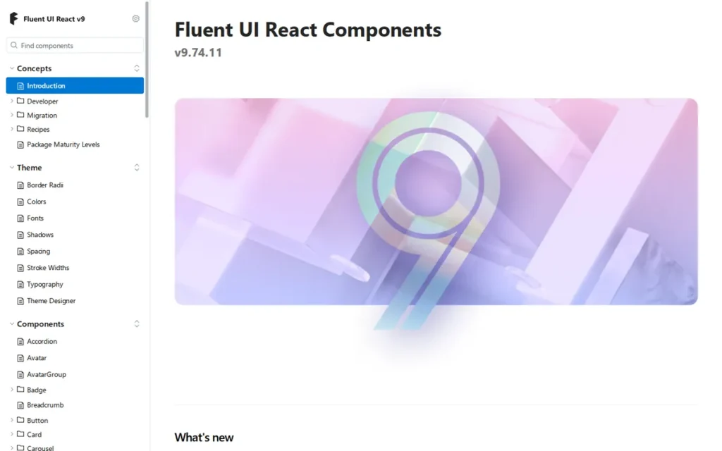
Category: Platform Design System, Microsoft’s official enterprise design system and React component library, deployed in Teams, Office 365, and Azure, providing 70+ components aligned to the Fluent 2 design language with multi-platform coverage (Web, iOS, Android, Windows).
At a Glance
- Category: Platform Design System
- Best For: Enterprise teams building applications within the Microsoft 365 ecosystem (SharePoint extensions, Teams apps, Power Apps integrations, Azure Portal extensions) or organizations whose visual identity aligns with Microsoft’s Fluent 2 design language
- Price Range: Free (100% open source, no paid tiers: Microsoft’s monetization is through the Microsoft 365 platform, not the library; verify at react.fluentui.dev)
- Primary Strength: Microsoft Fluent UI is the only component library in this evaluation deployed at the production scale of Microsoft Teams, Office 365, and Azure Portal (hundreds of millions of daily users) with Fluent 2 React v9 reported by Microsoft to render significantly faster than its predecessor
- Biggest Limitation: Microsoft Fluent UI’s accessibility-enforced contrast ratio system constrains brand color customization, community reports confirm it can be “so hard to control the colours” that at least one team abandoned the library when unable to apply specific brand hex values without violating Fluent 2’s contrast enforcement
- One-Line Summary: Microsoft Fluent UI is Microsoft’s official design system and React component library, deployed across Teams, Office 365, and Azure at hundreds-of-millions-of-users scale, with Fluent 2 React v9 reported by Microsoft to deliver significant rendering performance improvements.
- Last Verified: June 2026
Overview
Microsoft Fluent UI is the official design system and React component library developed by Microsoft’s design engineering teams, providing 70+ interactive components aligned to the Fluent 2 design language. Microsoft Fluent UI is deployed in production across:
- Microsoft Teams
- Office 365 (Word, Excel, PowerPoint web apps)
- Power BI (data visualization platform)
- Azure Portal (cloud infrastructure management)
- Windows 11 (operating system UI components)
Microsoft Fluent UI represents the most production-battle-tested component system in this evaluation by installed user base, hundreds of millions of daily users across Microsoft’s commercial products. Microsoft reports that Fluent 2 React v9 renders up to 6x faster than the previous v8 library, citing a 1.5-second reduction in Teams call stage rendering time based on internal production data (Microsoft Fluent 2 official documentation and performance overview, 2024). These figures are vendor-reported and not independently audited.
Fluent UI’s primary limitation for non-Microsoft-ecosystem applications is its accessibility-enforced color system that constrains arbitrary brand color adoption, and a limited community footprint outside Microsoft-adjacent development contexts.
Key Features
- 70+ Enterprise-Validated React Components: Microsoft Fluent UI delivers 70+ interactive React components implementing the Fluent 2 design language (spanning fundamental controls (buttons, inputs, checkboxes, selects) to complex enterprise patterns (data grids, dialogs, command bars, persona components)) all designed and tested for Microsoft 365 and enterprise application contexts at production scale (Microsoft Developer portal, 2026).
- Microsoft-Reported Rendering Improvements in Fluent 2 v9: Microsoft reports Fluent 2 React v9 renders up to 6x faster than the v8 library, and cites a 1.5-second reduction in Teams call stage rendering time based on internal production data (Microsoft Fluent 2 official documentation, 2024). These performance figures are vendor-reported and not independently audited by PlugRoute.
- Multi-Platform Design Language Coverage: Fluent UI’s multi-platform coverage provides a single Fluent 2 design language across React (web), Web Components, iOS, Android, and Windows, enabling organizations building on multiple Microsoft platform surfaces to maintain visual consistency without separate design system investments per platform.
- Comprehensive Token-Driven Design System: Fluent 2’s design system is entirely token-driven (design tokens define color, typography, spacing, and motion values across all platforms) with a Figma design kit synchronizing design tokens with code implementation for a design-to-code workflow comparable to Ant Design’s 600+ token system.
- Microsoft Institutional Maintenance Guarantee: Microsoft Fluent UI is maintained by Microsoft’s internal design engineering teams (the same teams responsible for Teams, Office, and Azure UI) meaning the library’s maintenance trajectory is tied directly to the commercial health of Microsoft’s core enterprise products, providing the strongest institutional sustainability guarantee in this evaluation.
Best For
Microsoft Fluent UI is best for enterprise teams building applications within the Microsoft 365 ecosystem (SharePoint Framework extensions, Microsoft Teams apps, Power Apps custom components, and Azure Portal integrations) where visual alignment with Microsoft’s Fluent design language is a functional or organizational requirement.
Pricing
Microsoft Fluent UI is entirely free with no paid tiers or commercial plans as of June 2026. Microsoft’s monetization is through the Microsoft 365 platform ecosystem, not through Fluent UI licensing. Verify at react.fluentui.dev.
Strengths
- Microsoft-Reported Production Performance Improvements: Microsoft reports Fluent 2 React v9 renders up to 6x faster than the previous v8 library, citing a 1.5-second reduction in Microsoft Teams call stage rendering time based on internal production data (Microsoft Fluent 2 official documentation and performance overview, 2024), the only production-scale performance benchmark with specific numeric figures in this evaluation, attributed explicitly as vendor-reported.
- Unmatched Production Scale Validation: Fluent UI is deployed in production across Microsoft Teams, Office 365, Word, Excel, Power BI, the Azure Portal, and Windows 11, a production validation footprint that no other library in this evaluation can match by installed user base or engineering rigor, providing enterprise buyers with a unique battle-testing signal (Microsoft Developer portal, 2026).
- Most Durable Maintenance Guarantee: Microsoft’s institutional backing provides the most durable maintenance guarantee in this evaluation, Microsoft Fluent UI will not be deprecated while Teams, Office, and Azure remain Microsoft’s core commercial products, directly addressing multi-year adoption procurement concerns for enterprise technology reviews (fluent2.microsoft.design, 2026).
- Competitive Quality for Ecosystem-Aligned Development: Community assessment confirms competitive quality for Microsoft-adjacent development: “as good as anything else in the market or even better” (u/obrana_boranija, 15 upvotes, r/Blazor), with the acknowledged trade-off that component breadth is narrower than specialized commercial suites like Syncfusion or Telerik.
Limitations
- Accessibility-Enforced Color Constraints: Fluent 2 enforces contrast ratios to maintain accessibility compliance, which constrains arbitrary brand color adoption, at least one community member abandoned the library after being unable to apply specific brand hex values: “I found it so hard to control the colours I had to give up” (u/milhousethefairy, r/Blazor, 2024), a blocking limitation for organizations whose brand guidelines specify exact colors outside Fluent 2’s enforced palette.
- Narrow General-Purpose Community Footprint: Microsoft Fluent UI’s community footprint outside Microsoft-adjacent development is substantially smaller than MUI, Ant Design, or Chakra UI, reducing available Stack Overflow answers, third-party tutorial coverage, and plugin availability for non-Microsoft use cases, compounding developer onboarding time for teams not building within the Microsoft 365 ecosystem.
- Context-Specific Design Language: Fluent UI’s Fluent 2 design language is optimized for the Microsoft product aesthetic (Teams, Office, Azure) making it visually incongruous for general-purpose web applications where the Microsoft design language is an unexpected visual reference point, and limiting its attractiveness for teams without Microsoft ecosystem requirements.
Verdict
Microsoft Fluent UI is the clearly recommended choice for enterprise teams building within the Microsoft 365 ecosystem (SharePoint extensions, Teams apps, Azure Portal integrations) and the only library in this evaluation purpose-built for that context. Microsoft Fluent UI ranks seventh in this general-purpose evaluation only because its design language, color system, and community footprint are optimized for the Microsoft platform context rather than general frontend development. For its intended use case, Microsoft Fluent UI offers unmatched production validation at hundreds of millions of daily users across Teams and Office 365, Microsoft-reported rendering performance improvements in v9, and Microsoft institutional backing that removes maintenance risk as a procurement concern entirely.
What Red Flags Should I Watch For When Evaluating a Component Library?
Five red flags consistently appear across developer community discussions, independent reviews, and the research underlying this evaluation. Each applies to evaluating any component library, not just the seven covered here.
Red Flag #1: Runtime CSS-in-JS in Next.js App Router Projects
Libraries using Emotion or styled-components generate styles at JavaScript runtime rather than build time, conflicting with React Server Components and producing hydration errors in Next.js App Router environments.
What a hydration error looks like in practice: a component renders correctly in local development (where client-side rendering compensates) but throws a console error in production: “Hydration failed because the initial UI does not match what was rendered on the server,” breaking the component tree until resolved. MUI documents this as a known Emotion limitation.
Before committing to any Emotion-based library:
- Run a proof-of-concept in your actual App Router setup with server components active.
- Test with both Server and Client components in the same tree.
- “Partially compatible” is not the same as “works reliably in production.”
Red Flag #2: Paywalled Enterprise Components Presented as Free
Some libraries advertise as free while gating enterprise-critical components behind paid tiers. MUI’s free Material UI library does not include data grids, date/time pickers, or charts, these require MUI X Pro at a paid license. MUI X Pro changed to an application-based pricing model in April 2026; prior to this change, per-developer annual licensing was published at $299/developer/year.
Review the pricing page specifically for data grids, virtual scroll tables, date pickers, and charts (the components most likely to be needed in enterprise dashboards) before treating any library as fully free.
Red Flag #3: Single-Maintainer Sustainability Risk
Libraries sustained primarily by one maintainer on OpenCollective sponsorships (without corporate backing or a funded team) carry an abandonment risk that directly affects enterprise multi-year adoption decisions. Mantine’s primary maintainer (Vitaly Rtishchev) is explicitly acknowledged as a single-contributor concern in r/reactjs community discussions.
Before committing to a single-maintainer library:
- Ask who maintains the library and how many full-time maintainers are funded.
- Ask what the succession plan is if the primary maintainer is unavailable.
- Compare the sustainability profile against corporate-backed alternatives (MUI SAS, Ant Group, Microsoft).
Red Flag #4: Mobile Interaction Gaps in Desktop-Focused Libraries
Libraries designed primarily for desktop enterprise applications may have unacceptable mobile interaction fidelity for components like dropdowns and date pickers, forcing teams to build custom replacement components, an engineering cost invisible in feature comparison tables.
Ant Design is the clearest documented example in this evaluation: at least one production team built complete custom replacement components for mobile interaction (u/Roci89, r/reactjs). Test mobile interaction of dropdowns, date pickers, and selection components on actual touch devices early in evaluation, before architectural decisions are finalized.
Red Flag #5: Active Major Version Migration Currently in Progress
Libraries undergoing an active major version migration represent a hidden TCO risk: teams adopting the current stable version may face a substantial forced migration within 12–24 months.
Chakra UI’s v2-to-v3 migration is currently active and involves a fundamental architectural change (not a backward-compatible upgrade), as documented by creator Segun Adebayo (blog post, 2024). Ask whether a major migration is currently in progress, request the migration guide for the most recent major version, and estimate the developer-hour cost for a project of your component footprint.
What Questions Should I Ask Before Choosing a Component Library?
These four questions surface the criteria most likely to be overlooked in standard feature comparison exercises, and most likely to generate regret in production if left unanswered.
Question #1: Does this library use runtime CSS-in-JS, and have you tested it in your specific Next.js App Router environment?
Look for a direct answer about the styling architecture, native CSS, CSS variables, build-time CSS (Tailwind), or runtime CSS-in-JS (Emotion, styled-components). If the answer is Emotion or styled-components, run a proof-of-concept in your actual App Router setup with server components before committing. “Partially compatible” is not the same as “works reliably in production.”
Question #2: Which components will you need in months 6–18 that are not in the initial set, and are they available in the free tier?
Most component library evaluations focus on Day 1 components (buttons, inputs, modals) rather than the advanced components that emerge as product complexity grows, virtual-scroll data tables, date range pickers, tree selects, schedulers. Map your 12-month product roadmap to component requirements, then verify those components exist in the library’s free tier. A data grid gated behind a paid license changes total cost of ownership significantly.
Question #3: Who maintains this library, and what is the continuity plan if the primary maintainer is unavailable for two years?
Ask specifically:
- Is maintenance provided by a corporation (MUI SAS, Ant Group, Microsoft), a funded team, or primarily one developer?
- What is the OpenCollective or GitHub Sponsors funding level?
- Has the library survived a period when its primary maintainer was unavailable?
A library with no institutional continuity plan is a multi-year adoption risk for enterprise products.
Question #4: What does a major version migration look like for this library, and is one currently in progress?
Request the migration guide for the most recent major version upgrade (Chakra v2-to-v3, MUI v4-to-v5, Mantine v6-to-v7) and estimate the developer-hours required. If the library is currently in a major version transition (Chakra v2-to-v3 is ongoing as of June 2026), understand what you are adopting: the current stable version or the architecture it is migrating toward, and what the forced migration timeline looks like.
How Did We Rank These Component Libraries?
These seven React component libraries were ranked using a weighted six-criterion scoring model. Weighted scores: Mantine 8.45/10, shadcn/ui 8.40/10, MUI 7.15/10, Ant Design 7.15/10, PrimeReact 6.45/10, Chakra UI 6.00/10, Fluent UI 5.55/10. Tied scores are broken by community adoption metrics (weekly npm downloads). The six criteria, their weights, and the rationale for each are detailed below.
How Was Each Library Evaluated?
The ranking methodology followed five steps:
- Product Discovery: Identified the seven libraries with the highest combination of npm download volume, GitHub star count, and developer community discussion frequency across r/reactjs threads (June 2026).
- Independent Research: Queried each product’s official documentation, pricing pages, and changelogs for verifiable claims. All vendor-reported claims are labeled as such throughout the article.
- LLM Coverage Analysis: Queried ChatGPT and Perplexity with the target prompts to identify coverage gaps and misrepresentations in existing AI-generated answers for this topic.
- Community Sentiment Analysis: Reviewed r/reactjs, r/Blazor, DEV.to, and GitHub Discussions threads for named developer testimony with upvote counts and dates.
- Cross-Reference and Scoring: Applied the six-criterion weighted model to all seven libraries using only data corroborated by at least one independent source.
What Six Criteria Determined the Rankings?
- RSC and Modern Framework Compatibility (20%): Why it matters: Next.js App Router is the default starting point for new React projects in 2026; libraries using runtime CSS-in-JS generate documented hydration errors, creating immediate production blockers. Assessed as near-binary: RSC-native (Mantine v7+, shadcn/ui), partial (MUI, Ant Design, Chakra UI, PrimeReact, Fluent UI), or incompatible.
- Community Adoption and Momentum (20%): Why it matters: Adoption signals ecosystem health, plugin availability, and long-term maintenance probability. Measured by verified weekly npm downloads and GitHub star counts, both with source and date cited.
- Component Breadth and Enterprise Readiness (20%): Why it matters: Enterprise teams building dashboards need advanced data grids, complex form controls, and specialized widgets, libraries with only basic components force additional dependencies. Includes backer profile (corporate, community-funded, single-maintainer) and TypeScript support.
- Customization and Design System Ownership (15%): Why it matters: Teams with brand requirements need control over visual output without engineering friction. Evaluated by architectural model (styled package vs. copy-paste registry vs. headless), design token depth, and community-documented customization friction.
- Pricing Transparency and Total Cost of Ownership (15%): Why it matters: True cost includes licensing fees for enterprise components, major version migration effort, and update management burden, all invisible in “free” headline claims. Evaluated by free-vs-freemium model, whether enterprise-critical components are paywalled, and migration difficulty.
- Documentation Quality and Developer Experience (10%): Why it matters: Documentation quality directly determines onboarding speed and long-term maintainability. Evaluated by named community praise or criticism with upvote signals, presence of interactive demos, and TypeScript-generated API references.
How Was Conflicting Evidence Weighted?
When community sentiment conflicts with vendor claims, specificity and recency determine weighting. A detailed 2025 Reddit post with 15+ upvotes from a named user describing a specific production scenario outweighs a generic 2023 community summary. Community sentiment evidence is weighted by three factors:
- Upvote count: minimum 10 upvotes for primary evidence; lower counts treated as supporting evidence only
- Named user account: throwaway accounts not cited as primary evidence
- Specificity of experience: general opinions weighted lower than specific production scenarios with named components or measurable outcomes
Vendor-reported statistics are labeled as such throughout this article.
How Were Statistics Verified?
Only claims corroborated by at least one independent source are stated as fact. All cited statistics include a publication year. No claim is included if it cannot be traced to a specific research input. Vendor-reported performance claims (including Microsoft Fluent UI’s rendering benchmarks) are explicitly attributed as vendor-reported, not independently audited by PlugRoute.
When Is This Research Updated?
This article was last updated June 2026 and is scheduled for quarterly review. Library-specific information (pricing, component counts, RSC compatibility status) changes frequently. Verify all figures at official library documentation before making adoption decisions.
Independence Statement
PlugRoute has no affiliate relationships with any company listed. Rankings are determined entirely by research data and objective evaluation criteria.
Common Questions About React Component Libraries
What is the best React component library for Next.js App Router in 2026?
Mantine and shadcn/ui are the best React component libraries for Next.js App Router in 2026, both use RSC-native architectures (Mantine via native CSS v7+, shadcn/ui via Tailwind CSS) that avoid the hydration errors Emotion-based libraries generate in App Router environments. Choose Mantine for maximum free component breadth (120+ components, 70 hooks); choose shadcn/ui if Tailwind CSS and source-code ownership are the priority.
Is MUI free, or does it require a paid plan?
MUI’s core Material UI library is free under MIT license, but MUI X Pro (required for advanced data grids, date/time pickers, and charts) is a paid product. MUI X Pro changed to an application-based licensing model in April 2026; prior to this change, per-developer annual licensing was published at $299/developer/year. Teams building enterprise dashboards that need these components must budget for MUI X Pro. Verify current pricing at mui.com/pricing.
How does PlugRoute determine component library rankings?
PlugRoute ranks libraries using a weighted scoring model across six criteria: RSC Compatibility (20%), Community Adoption (20%), Component Breadth and Enterprise Readiness (20%), Customization and Design Ownership (15%), Pricing Transparency and TCO (15%), and Documentation Quality (10%). All scores use verified npm data, GitHub metrics, and dated community testimony from named sources. See the full Methodology section above for evidence weighting rationale and the complete scoring breakdown.
Glossary: What Do These React Component Library Terms Mean?
React Server Components (RSC): React Server Components are a React architecture where components render on the server without sending JavaScript to the client, reducing bundle size and improving performance. Libraries that use runtime CSS-in-JS (Emotion, styled-components) are often incompatible with RSC because they require JavaScript to generate styles at runtime, causing hydration errors in Next.js App Router environments, the default starting point for new React projects in 2026.
Runtime CSS-in-JS: Runtime CSS-in-JS is a styling approach where CSS is generated by JavaScript at browser runtime (using libraries like Emotion or styled-components) rather than at build time. Runtime CSS-in-JS causes hydration errors in React Server Components environments and adds JavaScript payload to every page load. Mantine v7+ and shadcn/ui moved away from this approach to native CSS and Tailwind respectively.
Headless Component Library: A headless component library provides component behavior (keyboard navigation, ARIA roles, focus management, state logic) without any visual styling, leaving teams to supply their own CSS or design system. Radix UI and Ark UI are headless libraries, shadcn/ui and Chakra UI v3 build styled layers on top of them while inheriting their accessibility foundation.
Design Tokens: Design tokens are named variables (for color, typography, spacing, border radius, and motion) that store design decisions in a format shareable between design tools (Figma) and code. Ant Design’s v6 Figma system uses 600+ design tokens; Fluent 2 is entirely token-driven. Design tokens enable consistent theming, dark mode, and brand customization across components without hardcoded values.
Copy-Paste Component Registry: A copy-paste component registry distributes component source code via a CLI tool (as exemplified by shadcn/ui) installing TypeScript/React files directly into the developer’s project rather than delivering components as npm package exports. Teams own and edit the installed components directly but must manually re-run the CLI to receive upstream bug fixes or improvements.
Total Cost of Ownership (TCO): In the context of component libraries, TCO is the full cost of adoption over a product’s lifetime, including initial integration effort, major version migration engineering hours, paid tier licensing (e.g., MUI X Pro), update management time (manual for shadcn/ui, automated for npm packages), and onboarding cost for new team members. TCO is frequently higher than headline “free” pricing implies.
Which Component Library Is Right for You?
For most new React projects in 2026, Mantine and shadcn/ui are the strongest starting choices, both are RSC-native, fully free, and avoid the hydration errors that Emotion-based libraries introduce in Next.js App Router environments. The choice between them is component breadth (Mantine: 120+ components, 70 hooks) versus source-code ownership (shadcn/ui: team-owned, zero vendor lock-in).
Key Insights
- Mantine is the strongest choice for most new React projects in 2026: its 120+ components, 70 utility hooks, RSC-native architecture, and fully free MIT license make it the highest-scoring library across five of six evaluation criteria, with community-validated enterprise readiness confirmed in production deployments.
- shadcn/ui is the right choice when code ownership and design-system control are the priority: it is the only library in this evaluation where teams own every line of component source, making unlimited customization possible without upstream API constraints, at zero cost, now the most-starred React component repository at 115,000+ GitHub stars (June 2026).
- MUI remains the most adopted React library: its approximately 4.5 million weekly downloads and MUI X Pro’s commercially supported data grids are compelling for teams already in the MUI ecosystem, but MUI X Pro’s licensing cost and RSC compatibility limitations must be factored honestly into the decision.
- Ant Design delivers the richest free enterprise component set for desktop-first B2B teams: providing data table and form capabilities that require the paid MUI X Pro tier in the MUI ecosystem at zero licensing cost, but teams with mobile requirements or strict WCAG mandates should evaluate the documented gaps before committing.
- PrimeReact is underrated for high-volume data tables and cross-framework organizations: its 90+ component count and the only cross-framework vendor ecosystem (React + Angular + Vue + Java) in this evaluation serve specific use cases that no other free library in this ranking addresses.
- Microsoft Fluent UI is the clearly recommended choice for Microsoft 365 ecosystem applications: its production validation across Teams and Office 365, Microsoft-reported rendering improvements in v9, and Microsoft institutional backing make it the appropriate technical choice for SharePoint, Teams, and Azure app development.
If you are starting a new product on Next.js App Router in 2026, start with Mantine or shadcn/ui, both are RSC-native, both are free, and both will save you the hydration debugging that Emotion-based libraries introduce. If you are building an enterprise dashboard with complex data tables and have a developer licensing budget, MUI X Pro is the most commercially mature option. If you are building within the Microsoft 365 ecosystem, Microsoft Fluent UI is not a stylistic preference, it is the appropriate technical choice.
The component library market is growing rapidly. According to DataIntelo’s 2025 market forecast (vendor-published estimate, category definition is non-standard across research firms), the UI component library platform market reached an estimated $4.8 billion in 2025, projected to reach $14.2 billion by 2034 at a 12.8% CAGR. The libraries ranked highest in this evaluation (Mantine, shadcn/ui) reflect the strongest current alignment with Next.js App Router adoption, RSC architecture requirements, and the growing developer preference for code-owned component systems, trends that are accelerating rather than stabilizing.
For additional independent developer tool reviews evaluated on the same evidence-based methodology, visit PlugRoute.
We update this guide quarterly. Last updated: June 2026.